Bug #4701
openInconsistent padding and margin on bottom docked switchbar
0%
Description
Hi,
I'm in the process of migrating over from mIRC.
When configuring the switchbar to bottom placement I came across some small styling issues:
For a single server window there is 1px margin at the left and at the bottom and 3px margin between the buttons.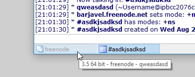
For multiple server windows a separator is added causing the margins to change. Now there is suddenly 4px margin below the buttons, most likely because of the separator height. Also there is different margins to the right and left of the separator.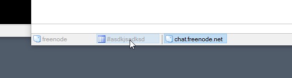
Also the icon seems to be moving a round a bit (1px to the right or so) when clicking the button.
My suggestion:
- Button margin top and bottom 2px
- Button margin left 3px
- Separators have their own 3px margin left and right which adds to 6px between a separator and a button
- Give the buttons some inside padding so the icon is sticking to the button border. Maybe even a bit more padding than my example would be good, I took inspiration from mIRC here.
I think this would give the switchbar a bit more airy look and it wouldn't appear so squeezed.
Thank you
Best regards
Files
PA Updated by Per Amundsen over 6 years ago
- Status changed from New to Assigned
I'll look into inconsistency with the separators and the icon shift on click.
Not gonna change the padding for now, users typically doesn't like changes and typically doesn't like padding in my experience.
XX Updated by x x over 6 years ago
Hi, thanks for your response.
Maybe you are right about padding. It is just an aesthetics thing and that is heavily subjective.
The main reason that I asked for padding is actually the overall height of the buttons. In mIRC they are a couple of pixels higher and that makes a bit easier clickable for me.
Since there is already an option for button width, maybe you could enhance that with a button height configuration option? That would be great.
PA Updated by Per Amundsen over 6 years ago
- Target version changed from 3.5 to 3.6
In the next beta (soon) the icon shifting should be fixed, also the separator/window paddingshould be more consistent, not decided on the height so keeping this open for now.
XX Updated by x x over 6 years ago
Just tested the latest beta.
From what I see the horizontal padding between the buttons and the separators seems changed.
The separators themselves still seem to mess with vertical height.
The buttons could still use 1-2px bottom padding, so their icon is not glued to the border.
Looking forward to the next release.